The Face of Fiction: A Book Cover Critique
A designer's brutally honest critique of popular book covers.
Design isn’t subjective. It’s why when you see great art, you might not get it, but when you see great design, you at least understand it—even if you don’t like it.
So, there is a layer of subjectivity between the lines of design. Personal taste, cultural influences, and individual preferences all play a role. What one person finds gorgeous, another might find boring. For example, some people love minimalist book covers, while others prefer detailed illustrations. Subjectivity bleeds into design when discussing aesthetics, emotional impact, and stylistic choices.
However, at its core, design lives by principles that determine whether something works or fails functionally. These principles are objective and apply regardless of personal taste. (Maybe I’ll get into that in another article)
A great designer can balance intuition (the subjective) with technical prowess (the objective) to create a stunning book cover that works.
Who am I to speak on any of this? I’ve studied and worked as a designer for the past sixteen+ years, and I have a lot to say about book covers—because one day, my book covers will need to be designed, and a terrible book cover scares me.
Without further ado, here’s today’s critique.
Yellowface
By R. F. Kuang | Score: ⭐️⭐️⭐️⭐️⭐️
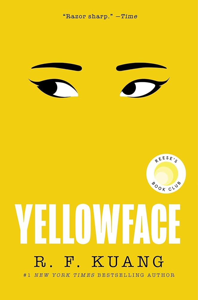
I wanted to start this series strong. Yellowface is an incredible book cover because it accomplishes several things:
The story’s idea is captured within the cover itself. Aka, it’s got a strong and well-executed concept. VERY few books can achieve this. When a designer can capture the ‘idea’ of your story, they are worth their weight in literary gold.
It's a minimal pop of color that will catch the eye across a bookstore. On top of that, a bold set of eyes will double this effect since humans have a weird—and creepy—knack for being drawn to eyes.
What’s interesting here is that Kuang is known for Fantasy, but this book is Literary. Her name is the smallest here than on any of her other books (at least from the US editions I’ve seen), which makes sense for readers who wouldn’t be familiar with her work.
What could be better?
I don’t have a ton to say in terms of criticism. But I will say that the white text on yellow (on a screen, at least) isn’t compliant with contrast standards. Meaning those with visual impairments may have difficulty reading the title. But it is intended for print, and most colors print darker than you see on a screen. And the white text is large—so it may be a non-issue.
The Fifth Season
By N. K. Jemisin | Score: ⭐️⭐️
This one hurts to critique. This has to be one of the top ten books I’ve ever read, but its cover doesn’t live up to that. Well, what works about it?
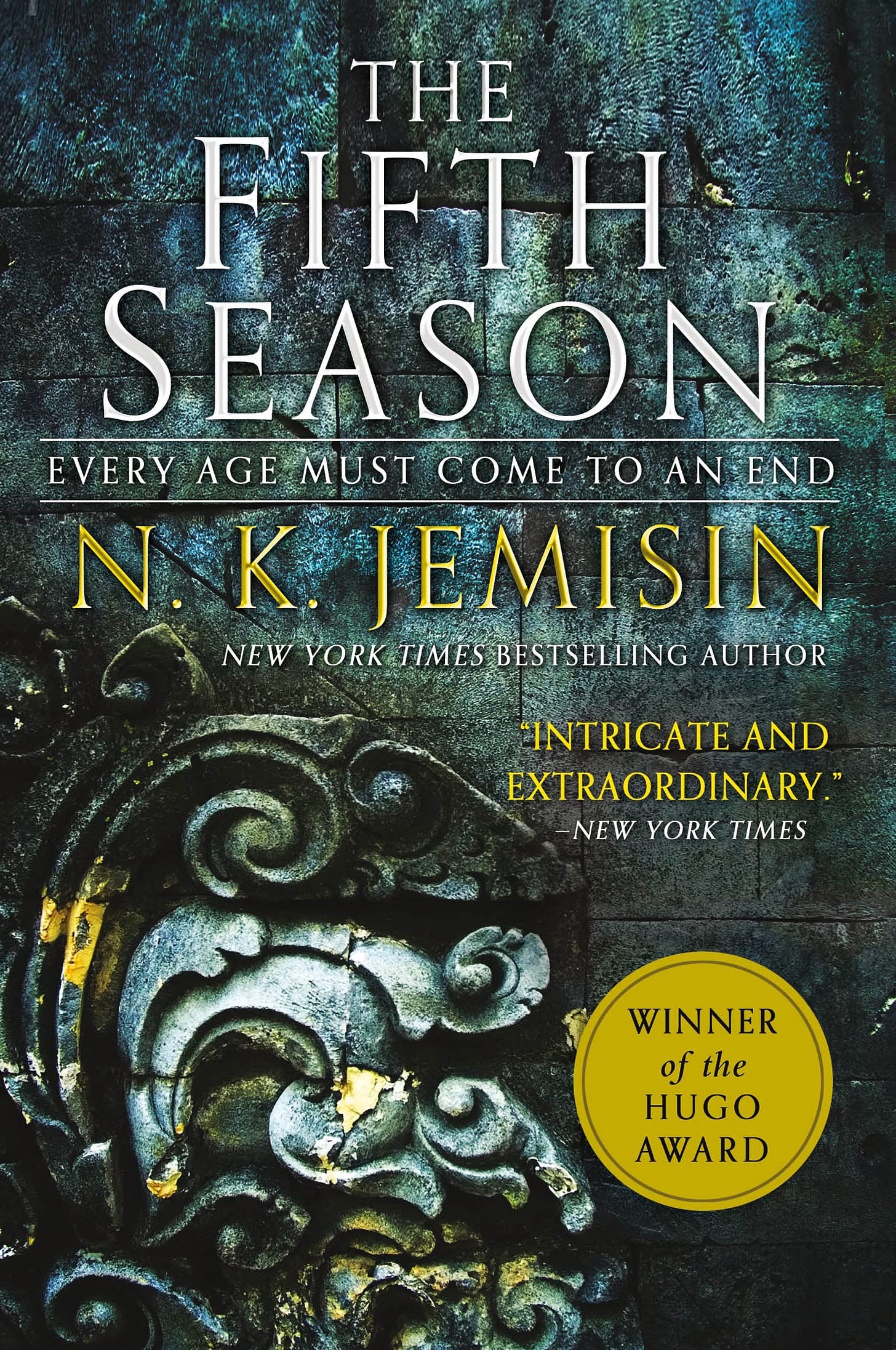
Tone and genre are represented here quite well. There’s no question about the dread represented by dreary stone.
I’ll also say it is ‘iconic’, but I attribute that more to its popularity and how the entire series keeps the same visual styling.
What could be better?
This design is uninspiring. And yes, I can see the mood and tone the designer may have been asked to create, but even something that should feel bleak can still be a cover that inspires the reader to pick it up. I delayed reading this book at first because the cover didn’t appeal to me, and if it hadn’t been for a friend promising me that it was amazing, I may have never read it.
All of the text feels so busy that it’s tough to scan, causing its readability to suffer. This is due to the stone background having the same clarity as something in the foreground. Add in the serifs, text effects, and center alignment; it feels like a jumble at the top.
Plus, all of the text is squashed at the top to draw the eye to the stone relief at the bottom—but what is it? Seriously, if someone knows, please tell me. It’s given the same emphasis as something that has meaning, but it’s more decorative than anything.
Fourth Wing
By Rebecca Yarros | Score: ⭐️⭐️⭐️
I’m critiquing the entire series since each book feels derivative of the previous one. So what works about it?
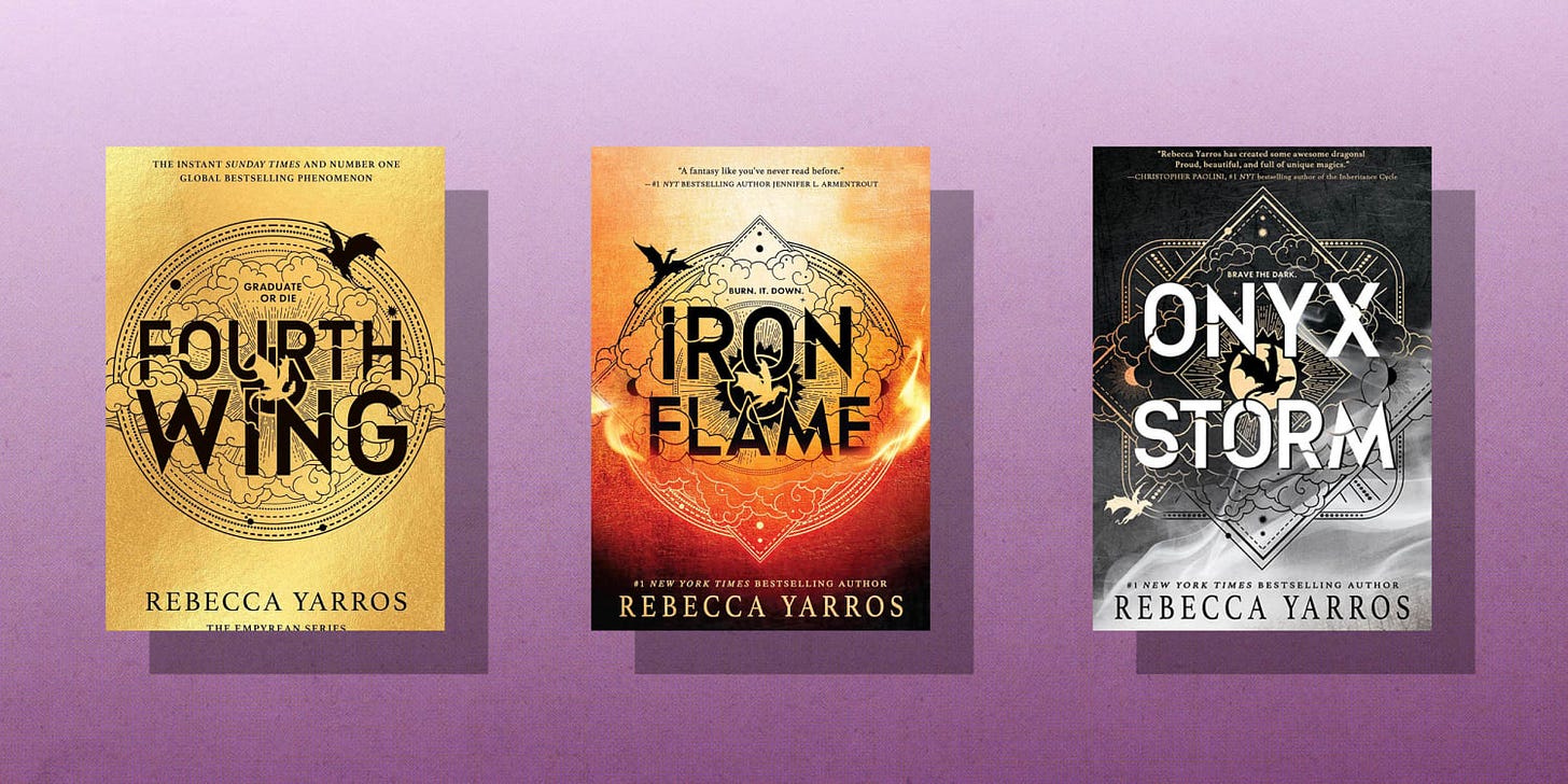
The titles are punchy. The hierarchy of seeing title → author → visuals are all executed well. Easy to read. No contrast issues.
The aesthetic feels both young and fantasy-esque. It tackles its target market somewhat well in this regard. It says, “I am a light version of the fantasy,” which will appeal to readers who like fantasy but are not reading the epics or grand stories the genre is known for.
The illustrations are fun and cute. There’s something to ‘discover’ on the cover, which plays to the fun someone may have reading this (‘graduate or…die’ is a very gripping detail). I will say the dragons feel like they are—or were inspired by—clip art. But the clouds and the little elements do balance out nicely.
What could be better?
Expectations. This is Romantacy—one of the biggest in the market. And yet, there’s nothing on this cover to tell you that. If anything, it feels misleading. If you didn’t know what the story was about, you’d think it’s just another YA fantasy. This is a huge miss because the fantasy elements in this story are somewhat surface-level, while the romance is the juicy thing readers are picking it up for.
Onyx Storm. WTF? Why is the text white? Why is the line height so much larger here? So much inconsistency. It’s giving this series is going off the rails. I get why they’d want some of these changes, but it feels sloppy.
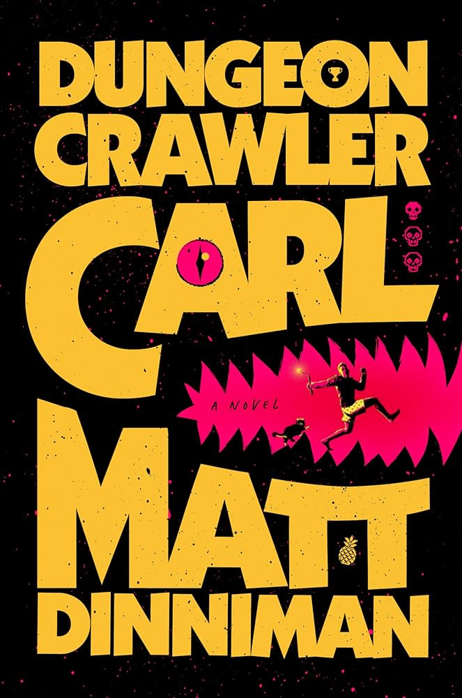
Dungeon Crawler Carl
By Matt Dinniman | Score: ⭐️⭐️⭐️⭐️⭐️
Such a fun cover. So, why does it work so well?
This is a bold move I don’t see many publishers take in fantasy/sci-fi, especially for a lit-fic. The uninspired designer or stakeholder may consider where this story fits on a shelf and say, ADD GOBLINS. Make it look like DND. That’s not inherently wrong, but it closes you off from better creative solutions.
What this cover does best is that it’s fun and quirky but still layered with a subtle seriousness. This cover uses the text as art, which gives it lots of energy and a loud voice. It teases the reader about what kind of narrator you’ll have. Little details like the skulls, mouth-shaped cave, a trophy, and cat speak to what you might expect. And the man (Carl) isn’t running towards something, but from, which tells you what kind of character you will get.
The thick sans-serif text with pointy ends feels very masculine (my assumption of who they anticipate their target audience to be). And the text is very easy to read.
What could be better?
I think this is near perfect. My biggest complaint is that the audio book covers are ass compared to this. I listened to the audiobook, and having that ugly (though arguably still on brand) image on my phone was not something I wanted to see all the time.
Let me know if you want me to critique your book (I’ll link it in my article) or if there is a book you’d like me to critique 😊
